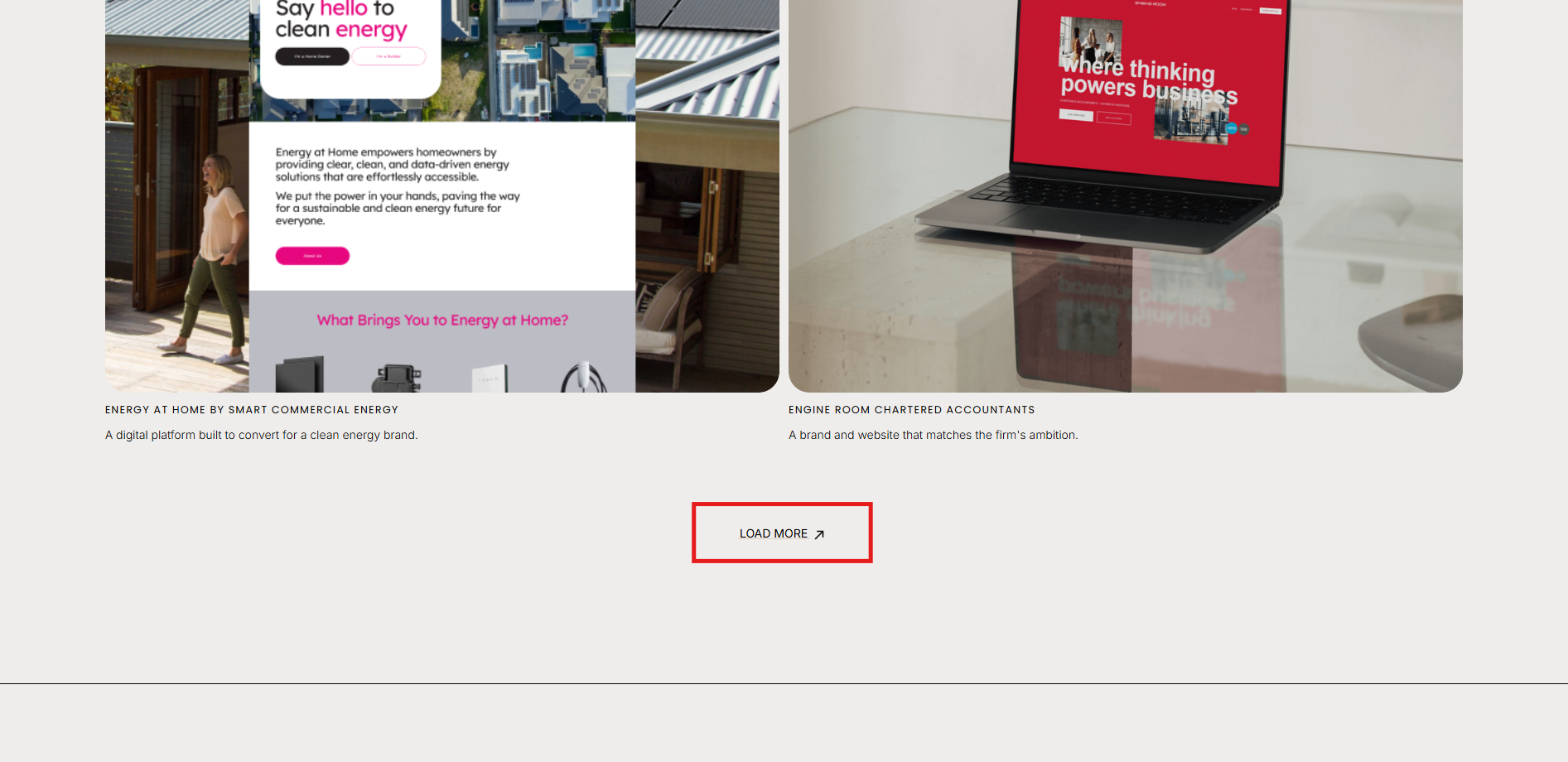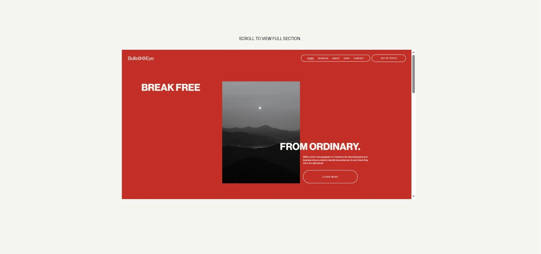
This code lets you insert a tall background (like a full-page web mockup) into your Squarespace site and allows it to scroll horizontally inside a container, without overflowing your layout.
Add code block.
Stretch block to cover entire section
Add images (you’ll need to grab the URLs from the Assets area).
Check the formatting on mobile and make sure the code block is sitting at the very back of the layout.
Click ‘Save’.
<html>
  <head>
    <style>
      body {
  margin: 0;
}

.slider {
  overflow: hidden;
  width: 100%;
  height: 100vh;
  position: relative;
}

.slider .slide {
  position: absolute;
  top: 0;
  left: 0;
  width: 100%;
  height: 100vh;
  background-size: cover;
  background-position: center;
  animation: slider 22.5s infinite;
}

.slider .slide:nth-child(1) {
   animation-delay: 0s;
  background-image: linear-gradient(rgba(0, 0, 0, 0.4), rgba(0, 0, 0, 0.5)), url(" image goes here ");
}

.slider .slide:nth-child(2) {
  background-image: linear-gradient(rgba(0, 0, 0, 0.4), rgba(0, 0, 0, 0.5)), url(" image goes here ");
   animation-delay: -4.5s;
}

.slider .slide:nth-child(3) {
  background-image: linear-gradient(rgba(0, 0, 0, 0.4), rgba(0, 0, 0, 0.5)), url(" image goes here ");
  animation-delay: -9s;
}

.slider .slide:nth-child(4) {
  background-image: linear-gradient(rgba(0, 0, 0, 0.4), rgba(0, 0, 0, 0.5)), url(" image goes here");
   animation-delay: -13.5s;
}

.slider .slide:nth-child(5) {
  background-image: linear-gradient(rgba(0, 0, 0, 0.4), rgba(0, 0, 0, 0.5)), url(" image goes here ");
   animation-delay: -18s;
}

@keyframes slider {
 0%, 13%, 100% {
   transform: translateX(0);
   animation-timing-function: ease;
 }
 20% {
   transform: translateX(-100%);
   animation-timing-function: step-end;
 }
 93% {
   transform: translateX(100%);
   animation-timing-function: ease;
 }
}
     </style>
  </head>

<body>
<div class="slider">
  <div class="slide" alt=""></div>
  <div class="slide" alt=""></div>
  <div class="slide"></div>
  <div class="slide"></div>
  <div class="slide"></div>

</div>
</body>
</html>
Check out our library of code snippets and site enhancements.