Full width newsletter block button on mobile in Squarespace

Here’s a quick tutorial on making the Squarespace newsletter field and button span full-width on mobile screen sizes to mobile-optimise the block properly as this currently isn’t a native feature.
1. Add the Newsletter Block to your page
Open the Page Editor in Squarespace and navigate to the page where you want to add the newsletter block.
Click Add Block and select Newsletter from the options.
Position the newsletter block where you’d like it to appear, typically below the main content or above the footer for higher visibility.
Customise the headline, description, and button text as needed. Keep the text short and direct to increase sign-ups on mobile.
2. Add Custom CSS
Squarespace doesn’t make blocks full-width by default, so we’ll add a small bit of custom code to make the newsletter block span the entire screen on mobile.
Go to Design > Custom CSS to open the CSS editor.
Add the following CSS to make the newsletter block full-width:
Code:
/* Full-width Newsletter Block for Mobile */

@media only screen and (max-width: 640px) { .newsletter-block .newsletter-form-button-wrapper, .newsletter-block .newsletter-form-button, .newsletter-block .newsletter-form-fields-wrapper, .newsletter-block .newsletter-form-field-wrapper, .newsletter-block .newsletter-form-wrapper--layoutStack .newsletter-form-field-wrapper, .newsletter-block .newsletter-form-wrapper--layoutStack .newsletter-form-name-fieldset, .newsletter-block .newsletter-form-name-fieldset {

width: 100% !important;

max-width: 100%;

display: block !important;

    } }

Learn how to make a Squarespace Archive Block dropdown full width with a simple CSS snippet. Fix narrow blog category menus and improve dropdown usability.
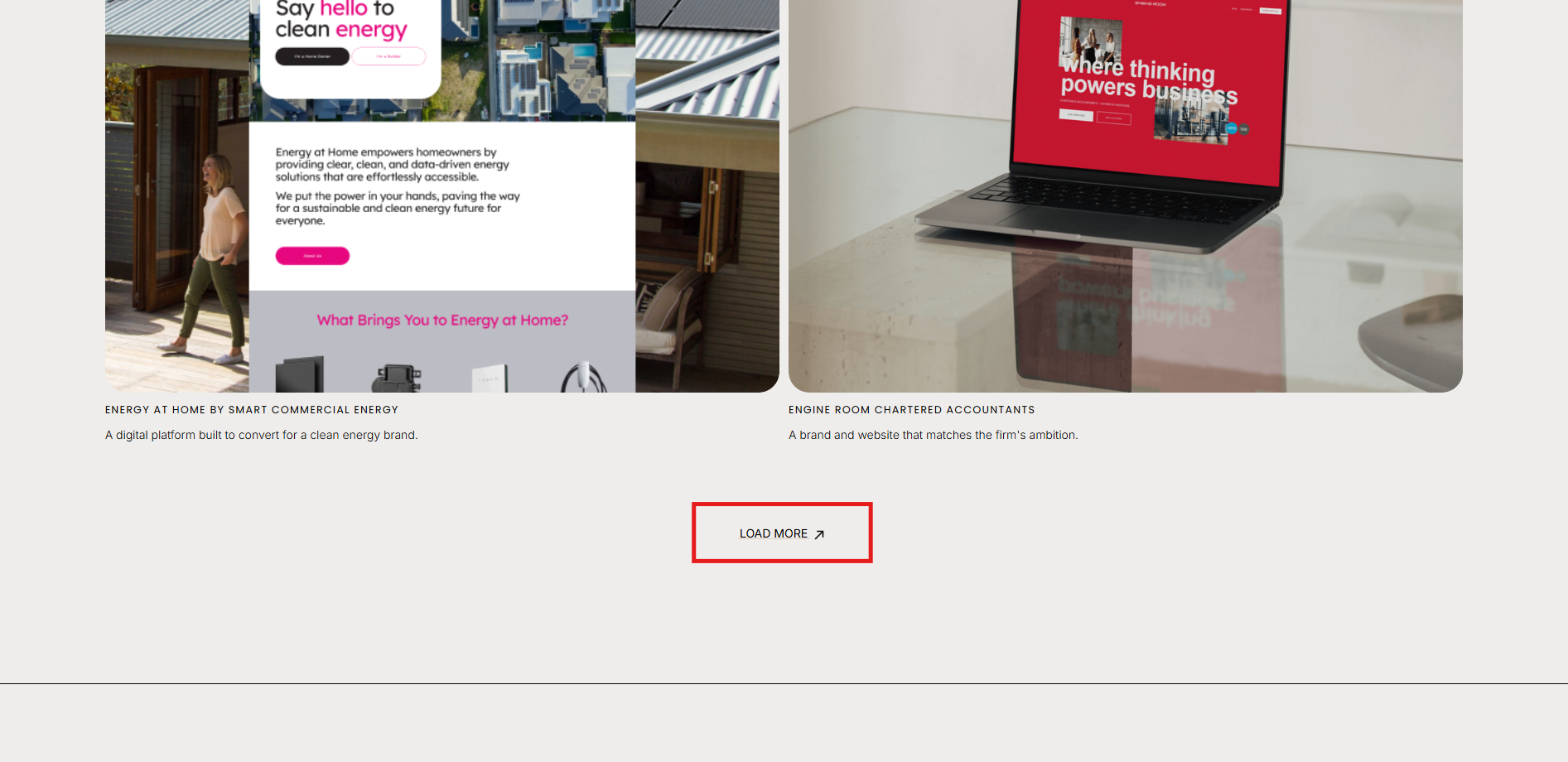
How to show / hide / reveal a Portfolio Section when you click a link or button in Squarespace. This code works when you cannot use the Anchor links functionality.
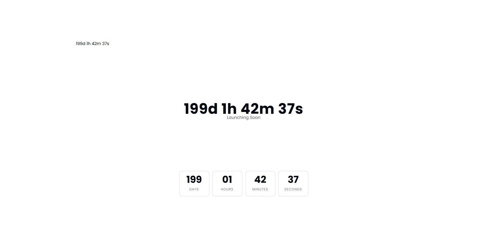
Add a countdown timer anywhere on your Squarespace page using a simple Code Block. Drive urgency for launches, promotions and events.
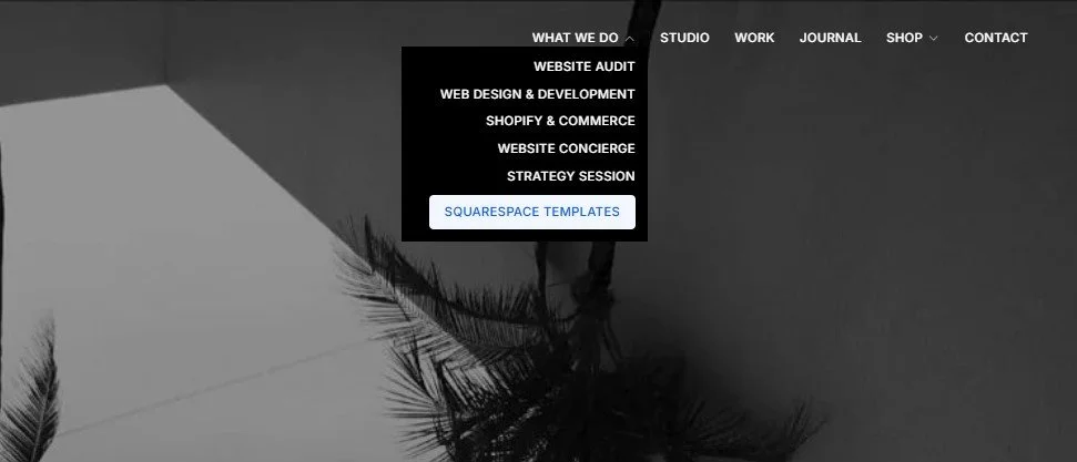

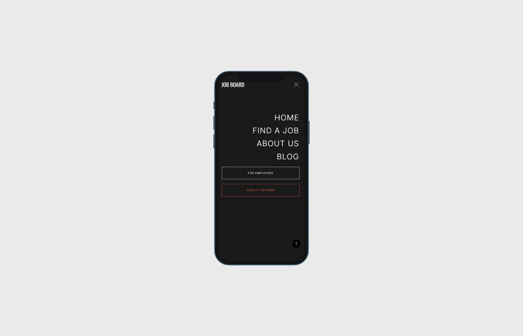

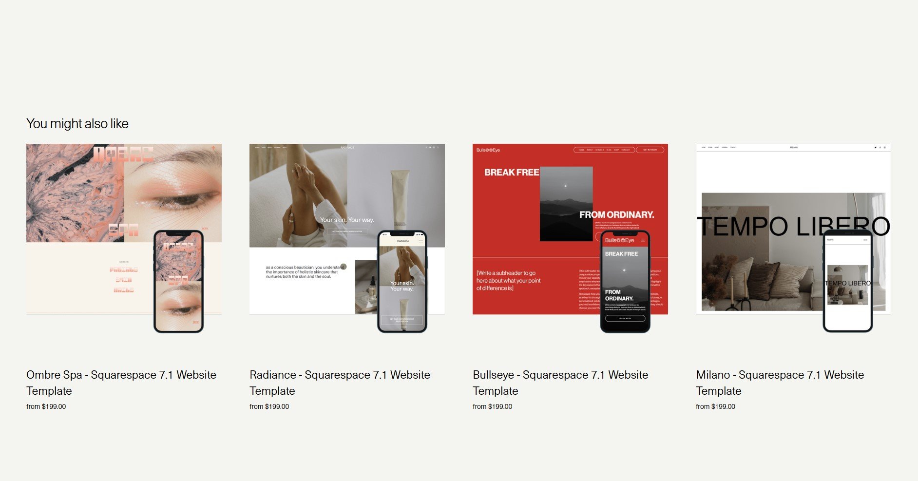
Learn how to display only four related products in a single row on your Squarespace Commerce site using a quick CSS solution


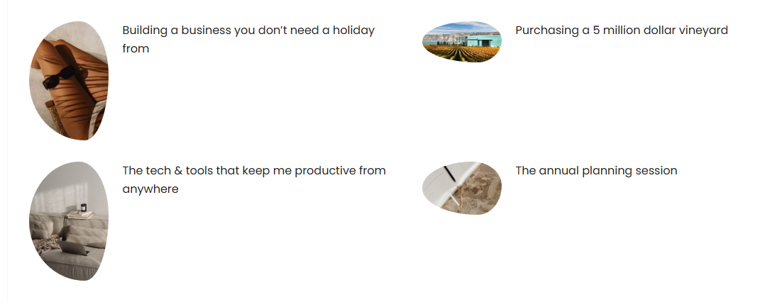
Learn how to apply irregular, organic image frames in Squarespace with a simple CSS snippet. Enhance your site's aesthetic with custom shapes.
Optimise your Squarespace shop for mobile: use custom CSS to stack categories and filters for a cleaner, more user-friendly experience.

Optimise your Squarespace masonry gallery for mobile: apply custom CSS to display images in a single column, improving navigation and aesthetics