
Is your navigation menu poorly structured? Find out.

Navigation menus are often treated as an afterthought - a simple list of links that “covers everything” your business offers. On launch day, it works. Visitors click. Pages load.
But as your business grows, pages expand, and ideas multiply, poorly structured menus reveal their fragility. They confuse users, create hidden operational debt and quietly reduce conversion.
Most menus fail because they try to serve every audience at once. Investors, first-time visitors, returning customers, clients - each has different goals. When all are lumped together, visitors must hunt for the link that matters to them, increasing cognitive load and frustration.
A menu isn’t just navigation. It’s infrastructure. And like any infrastructure, it needs to scale with your business.
What to look for? - Start with hierarchy
Identify primary objectives: What actions matter the most? What page supports that action?
Make secondary and tertiary links subordinate by design.
Use visual weight, placement and grouping to communicate importance.
Any link competing with the primary action is a structural flaw.
Menus also fail because they are static. As businesses grow., services expand or products multiply - the initial menu you had when you first got your website might not fit your current strategy.
Menu labels must be unambiguous
1. Speak the user’s language
Avoid internal jargon, brand-specific terms, or cute/clever labels.
Think about how your audience would describe what they’re looking for.
Test with people outside your team if possible: would they know where to click?
Example: Instead of “Solutions & Offerings,” use “Services” or “What We Do.”
2. Be specific, not generic
Broad labels like “Resources” or “Products” can be confusing.
Narrow it down to the primary outcome or category.
Example: Instead of “Products,” use “E-commerce Stores” or “Custom Websites.”
3. Prioritise action or outcome
Menu labels should hint at what the user can achieve by clicking.
Focus on verbs or clear nouns that describe the value.
Example: “Get a Quote” is clearer than “Pricing,” if the goal is conversion.

Spacing and rhythm matter
Crowded menus feel busy and cheap. Telling someone to go EVERYWHERE is essentially telling them to go nowhere.
Dropdowns, mega menus or multi-level structures should be used deliberately, not as decoration.
Poorly structured menus increase bounce rates because users cannot find what they need.
Make it hard to navigate your website and the user will simply leave.
Rule of thumb: Menus with more than 5 links should be grouped into clear sections. Every choice should reduce friction, not add it.
Generous spacing signals clarity, restraint and confidence. The difference is subtle but perceivable, visitors may not articulate it but it shapes trust and perception as they will feel guided through your website effortlessly.
The result of poor navigation is invisible chaos. The result of a well-structured menu is calm, clarity and reliable direction. Your business growth exposes weak foundations, your website is the same. Most navigation menus work fine on launch day. Scalable menus work under pressure, guiding visitors effortlessly while supporting operational efficiency.
Navigation is not decoration. It is infrastructure. And like any infrastructure, its strength is measured by how well it absorbs growth without collapse.

Most websites look harmless at first glance. But if not designed correctly, over time they start generating a kind of invisible work that drains your team’s time, attention and energy. Invisible work is the silent tax your business pays when a website is designed for launch, not for operation.
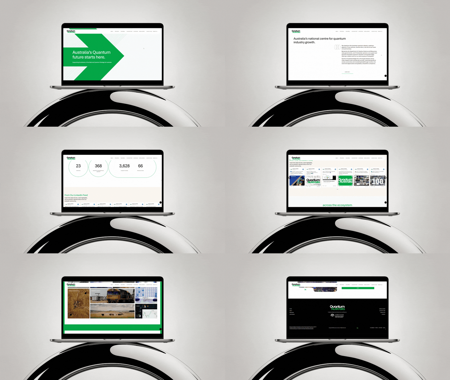
High-growth businesses often pour money into visually striking websites - cinematic hero sections, subtle motion, premium photography but the common misconception is that its not aesthetics that determine whether a company scales past $1M - its the infrastructure behind it.

The best premium Squarespace templates for small businesses. Launch fast, customise easily and market your brand from day one.

Discover the best platforms for building your eCommerce store, portfolio or membership site. From Shopify to Squarespace and WordPress, Gem Media breaks down the top tools to grow your business online.

Follow Gem Media’s step-by-step guide to plan, design, and launch a high-end website in just 3 days. Tips for luxury branding, copy and visuals.

Discover what your web developer isn’t telling you - from hidden costs to SEO gaps. Essential insights for business owners building smarter websites.
Gem Media is now a certified Squarespace Gold Partner. Discover what this recognition means for our clients and how we deliver strategic, luxury web design with proven expertise.

Your website is the lobby. It’s the first thing your guest sees, the moment they begin to imagine their stay. And just like the hotel itself, it should feel curated, seamless, and unforgettable.
Whether you're launching a new boutique accommodation or elevating an existing property, here’s how to build a website that doesn’t just look stunning - but also books.
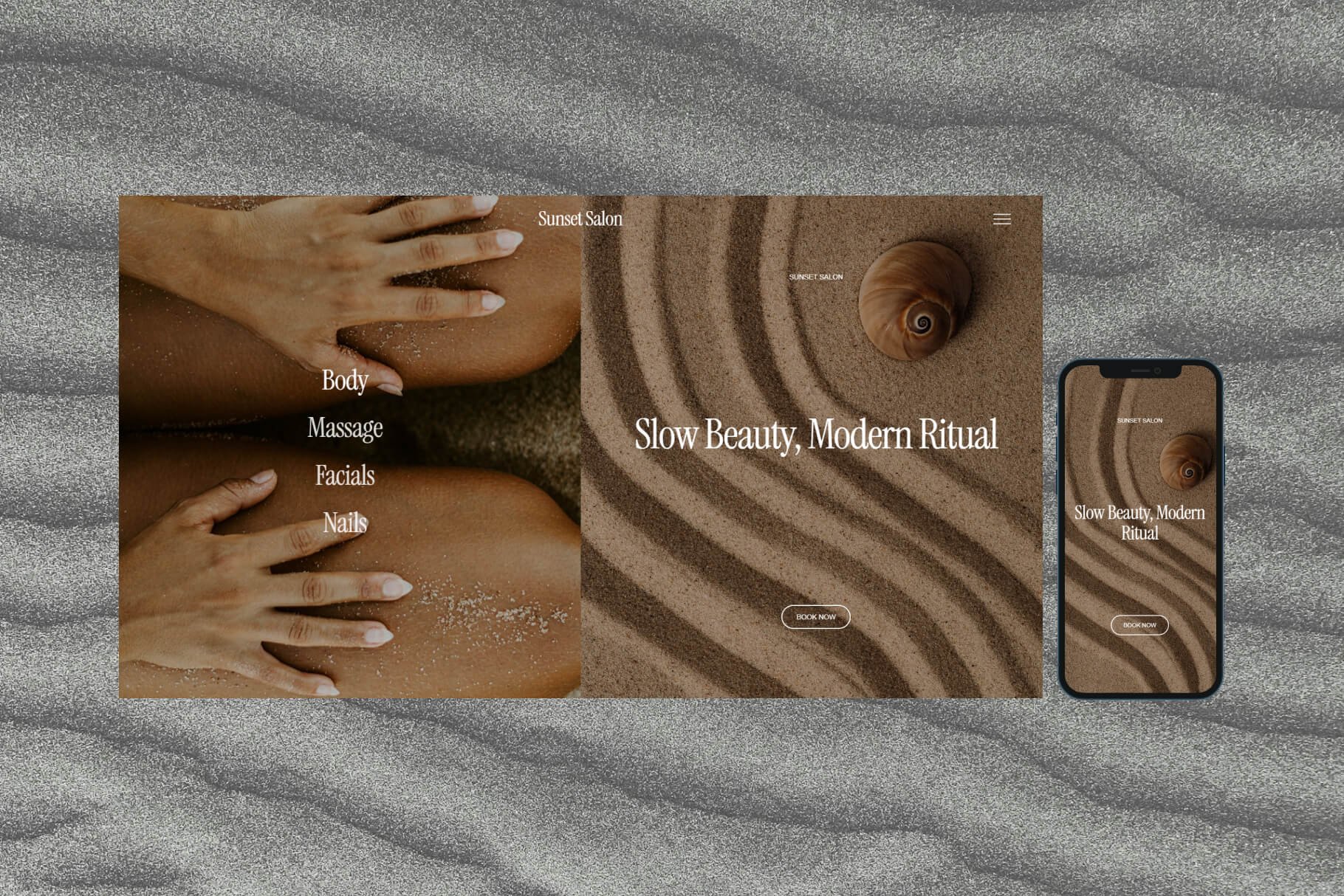
In the beauty and wellness world, your website is often the first point of contact - and first impressions matter more than ever. Your site isn’t just a digital brochure; it’s your brand ambassador, your silent salesperson, and your 24/7 booking assistant.

Don’t wait for your full site to go live. A polished Coming Soon page builds trust, captures leads and gives your brand a strong digital start from day one.

A CTA is more than a digital nudge. Rooted in behavioural psychology principles, it’s a brand touchpoint that signals confidence, clarity and an understanding of what your ideal client desires most. Whether placed on a homepage, embedded in an email or tucked into packaging, the most effective CTAs feel like personal recommendations rather than blunt directives.

Building a real estate website is a critical step in modernising your real estate brokerage, agent or property management business. A well-designed website is a hub for client engagement, property showcases and lead generation.

Perform a DIY website audit to ensure your site is fast, secure, and user-friendly. Learn how to check for issues like slow speeds, broken links, SEO performance, and security vulnerabilities. Keep your website in top shape for better conversions and long-term success.

Even traditional businesses like butcheries need an online presence to stay competitive and grow. A well-designed butchery website can do more than showcase your products. Here’s everything you need to know to build a website for your butchery that works as hard as you do.

10 strategies to increase your website's visibility and attract more visitors. Learn how to ensure your website stands out in in business.

Designing websites that earn trust: prioritise accessibility, privacy, honesty and meaning in every digital touchpoint.

Ready to create a website that sells more flowers and secures event bookings? Follow this guide to building a florist website that includes a shop for bouquets, a stunning portfolio, corporate flower services and SEO tips.

Discover the power of minimalist web design for both luxury and mainstream brands. Learn how to elevate your brand's aesthetic, enhance user experience and optimise your site for peak performance by embracing curated simplicity and showcasing quality over quantity.
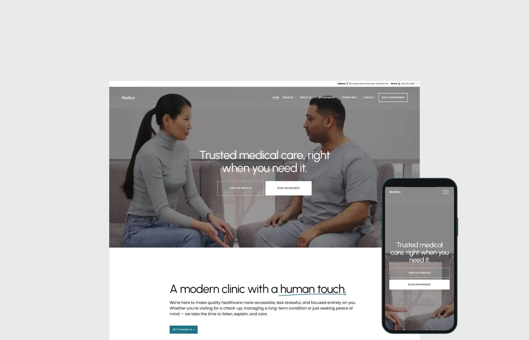
A compelling medical practice website is essential for attracting patients and building trust. This guide outlines key features to include, from patient data protection, HIPAA, intuitive navigation to secure payment processing to create a standout online presence.

Operations and management are two of the biggest burdens faced by small business owners. Luckily, there are plenty of tools out there that can automate time-consuming operations, management tasks, and even the entire booking process so you don’t have to worry about the details anymore.

Ready to take your restaurant online? Follow our comprehensive guide to build a restaurant website that attracts customers and gets tables booked.

Find out the purpose of that tiny date in your website footer and why it is important to make sure it is up to date!

Search Engine Optimisation (SEO) remains a cornerstone for businesses seeking online visibility from their competition. Understanding the intricacies of SEO has never been more crucial.

If you own a business, chances are you have a website. And if you have a website, you need to regularly back it up — yet so many businesses fail to do it regularly (if at all). Website backups are like an insurance policy for your site. They protect you in case of an emergency by giving you a copy of your site that you can restore if something goes wrong.

Your website is often your brand’s first impression - your digital storefront, sales funnel, and business card rolled into one. But without regular upkeep, even the best-designed site can quietly break down behind the scenes.

Are you running campaigns and spending money on pricey ad placements but not seeing the impact or return on the investment that you'd hoped for? You're not alone - many business owners find themselves over-investing in ads with limited success.

Discover how your online work can lead to digital emissions and find out the ways in which you can reduce your carbon footprint. Understand and explore the sources of digital emissions so that you can be a part of a mindful, greener future.

Learn who should be responsible for the maintenance and upkeep of your business website. Find out how to ensure it continues functioning optimally and seamlessly for customers and leads.

Learn how to get your website ready for the new year with this list of tips, tricks, and strategies that can help you make sure your site stays up-to-date.

Navigation menus are often treated as an afterthought - a list of links that “covers everything” the business offers. As soon as growth happens and pages expand as ideas grow, poorly structured menus reveal their fragility. They confuse users and create hidden operational debt.