Fuego Maria
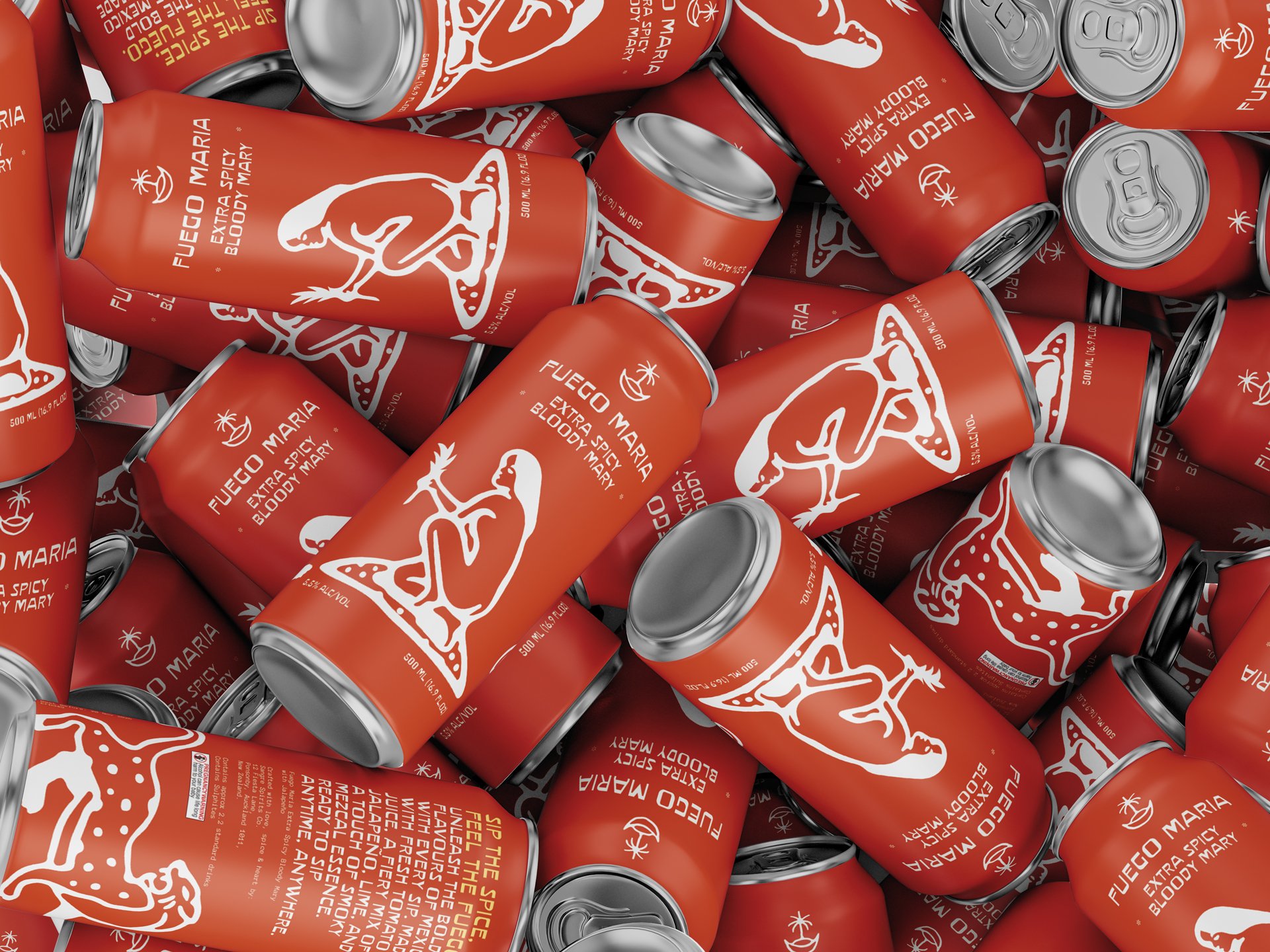
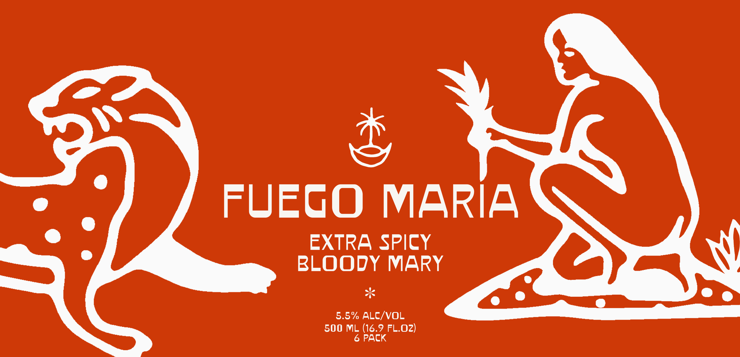
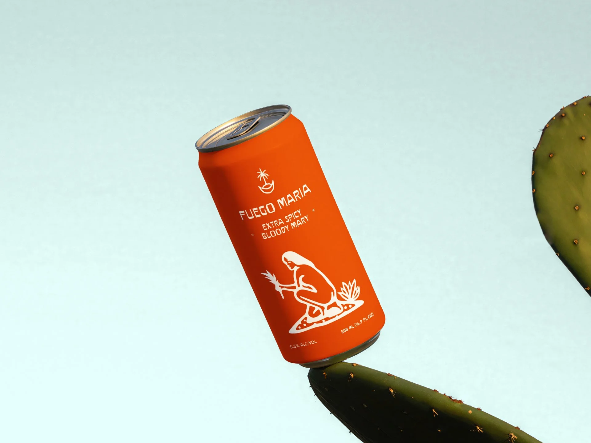
Brand identity and can packaging for a boldly crafted Mexican-inspired, RTD Bloody Mary.
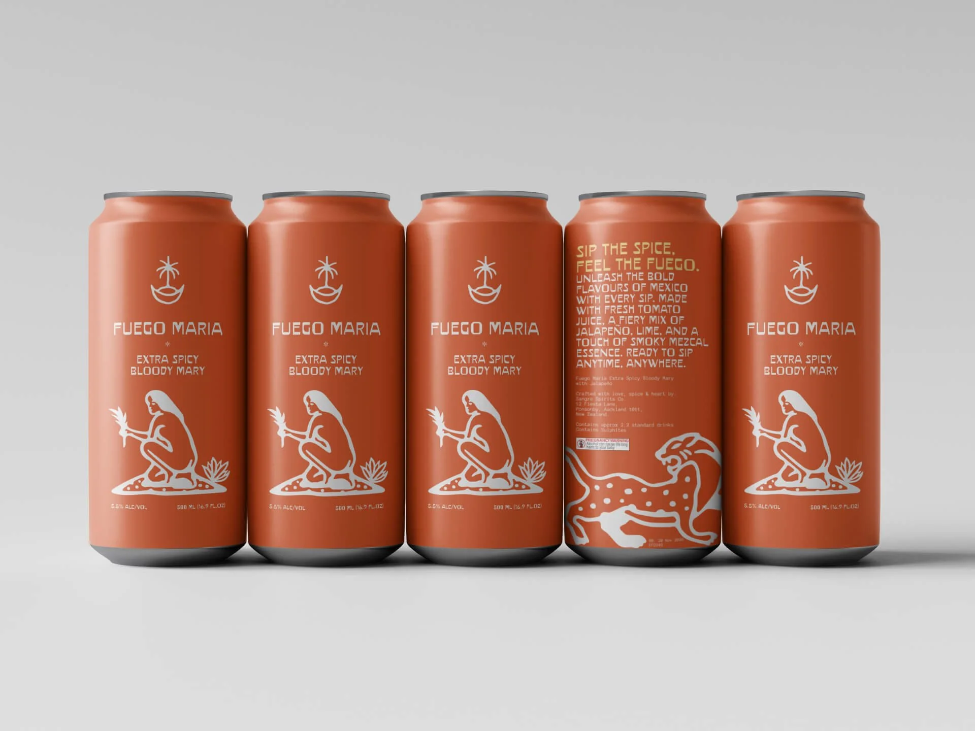
The RTD drinks market is one of the noisiest shelves in retail. Most brands compete through maximum surface area coverage, neon colours and font sizes calibrated for visibility at three metres rather than engagement at arm's length.
The Bloody Mary category adds a further constraint: strong visual heritage - the red, the celery, the hot sauce reference - that most brands lean into predictably, producing packaging that looks like a variation of everything that came before it. Fuego Maria was a self-initiated concept built around a different question: what happens when a Bloody Mary leaves its heritage behind entirely and relocates to Mexican visual territory instead.
The name encodes the brief. Fuego - fire, heat, Spanish - signals the flavour profile and the cultural shift simultaneously. Maria replaces Mary with a single letter change that moves the product from Anglo brunch tradition into something with more heat and more character.
"The Bloody Mary is one of the most opinionated drinks in the RTD category - which means its brand identity is either as opinionated as its drinkers, or immediately forgettable. Fuego Maria relocates the whole conversation to somewhere with better weather."